
Interface gallery
These are screenshots of the working workspace example, using UX components, the shared icon catalog, and semantic theme tokens. The screenshots use fictional data.
Try the components#
A workspace that follows the theme#
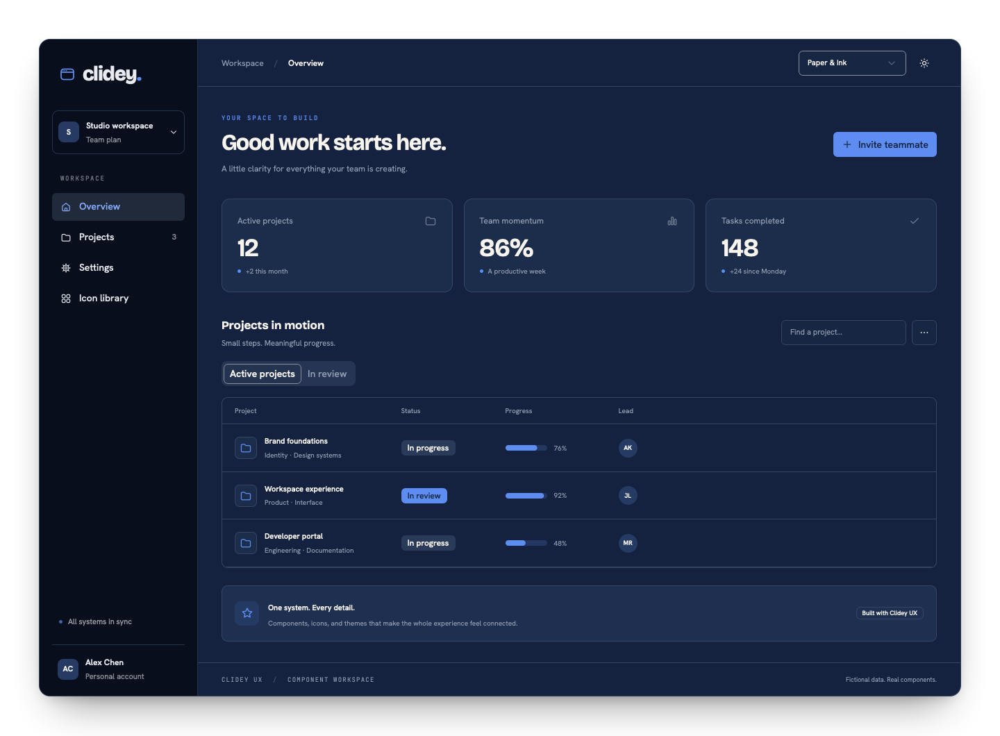 Workspace overview in Paper and Ink dark mode
The example combines cards, badges, a progress bar, tabs, table rows, tooltips, a menu, and an invitation dialog. Its navigation and actions are functional demonstrations.
Light is a first-class mode#
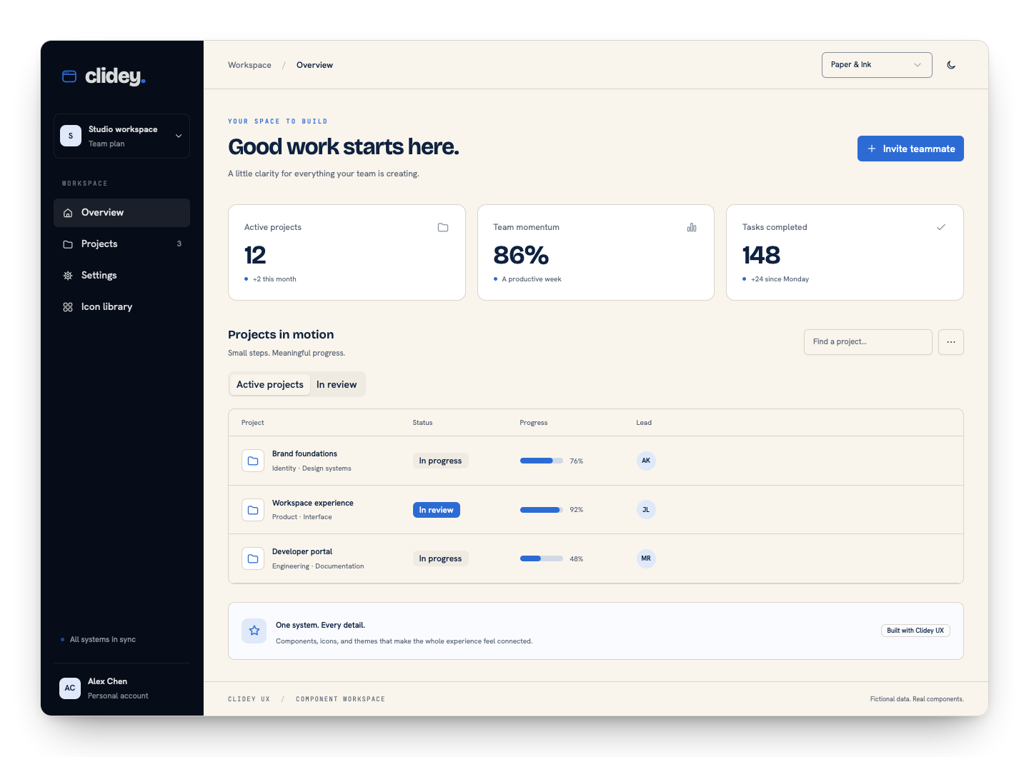 The same workspace in Paper and Ink light mode
Same composition, different character#
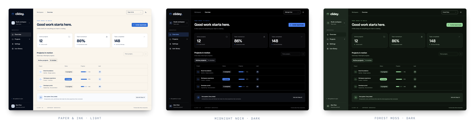 Three palettes applied to the same workspace
Palette changes affect surfaces, text, accent colors, and typography. The data and component hierarchy stay the same.
Forms that belong to the product#
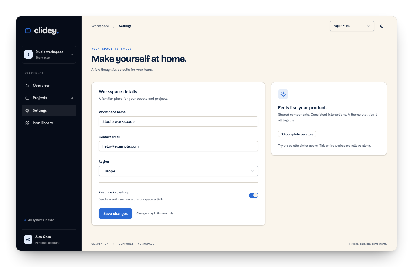 Workspace settings form using UX controls
The settings view composes labels, inputs, select, switch, and a save action. Saving updates local example state; it does not contact a backend.
One icon language#
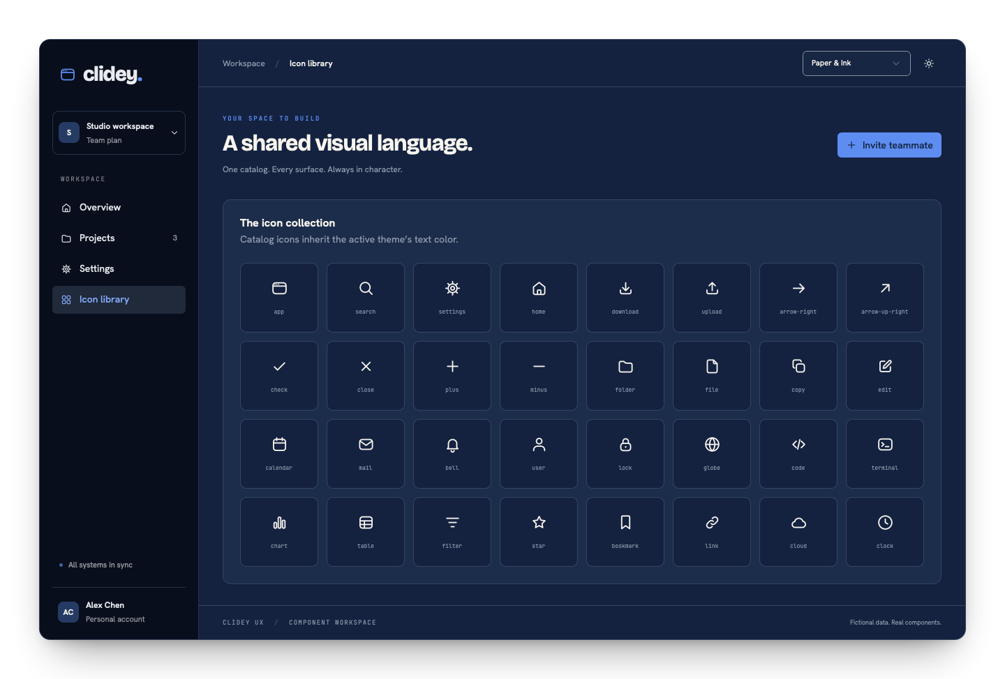 Catalog icons rendered with UX components
A contextual decision#
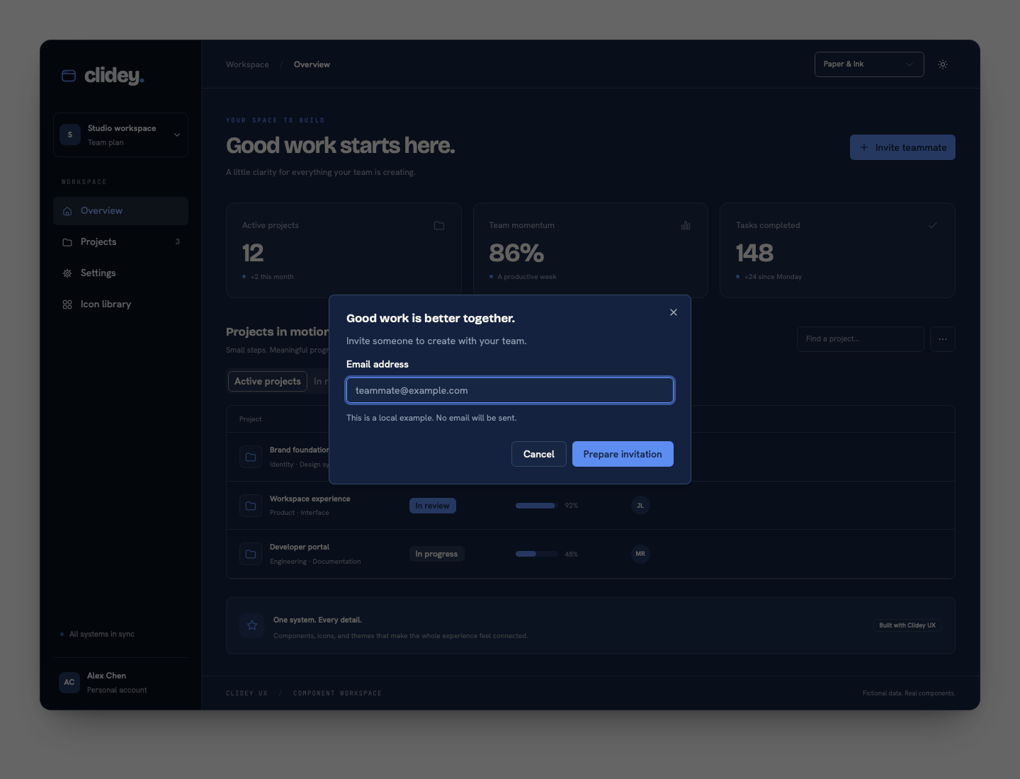 Invitation dialog with labeled fields and contextual help
Try it locally#
Bash
pnpm install --frozen-lockfile --ignore-scripts
pnpm dev:examples
Open http://127.0.0.1:3190/examples/workspace/. Switch the palette and mode, open the invitation dialog, navigate the views, and try keyboard navigation. The example is for exploration; it does not connect to a production service.
Was this page helpful?