
One system. Every product.
Clidey UX gives React applications a shared visual language: composable components, 30 complete theme palettes, and a 489-icon catalog. Build an interface once, then change its atmosphere without rebuilding its behavior.
Build your app with Claude or Codex
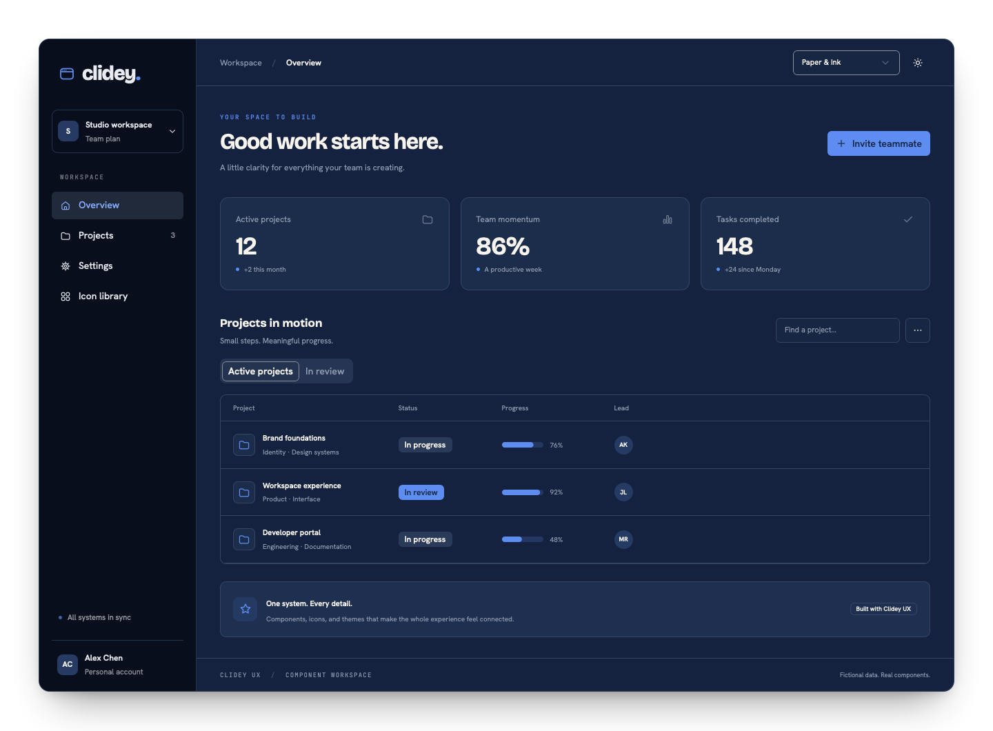 A workspace built with Clidey UX in Paper and Ink dark mode
The workspace above uses the actual package components. Its data is fictional; the example source is included in this repository.
A palette changes more than a button#
Surfaces, typography, focus rings, charts, navigation, shape, and motion belong to the same system. A palette gives these decisions a shared direction. Light and dark remain independent choices.
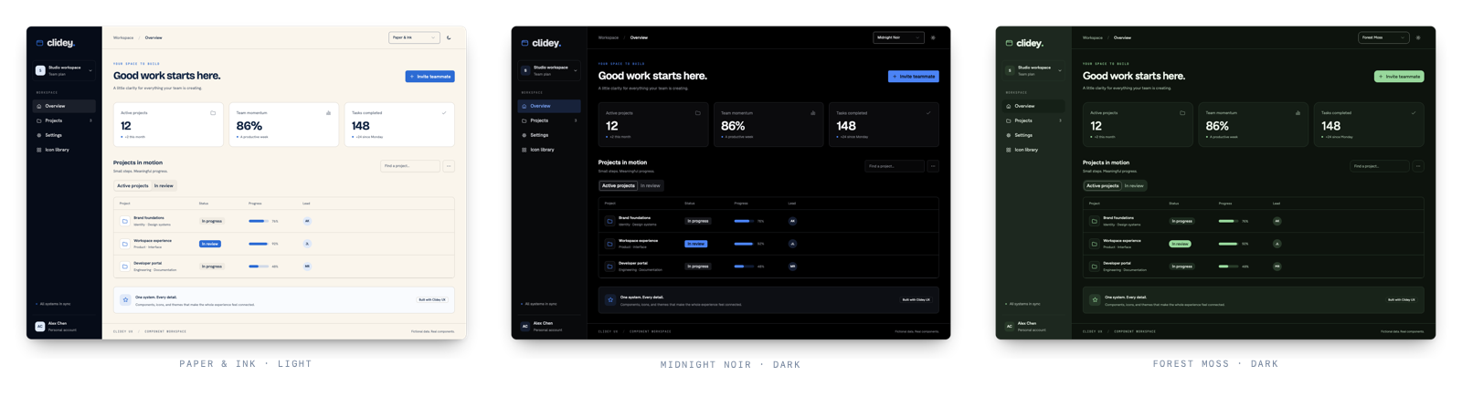 The same workspace in three UX palettes
TSX
import { ThemeProvider } from '@clidey/ux';
import '@clidey/ux/styles.css';
import '@clidey/ux/theme-fonts.css';

<ThemeProvider defaultPalette="paper-ink" defaultTheme="system">
  <App />
</ThemeProvider>
What you can build#
| Need | Start with |
|---|---|
| Product actions and forms | Button, Input, Select, SearchSelect, Checkbox, Switch |
| Application navigation | Sidebar, Breadcrumb, Tabs, Command |
| Decisions and contextual editing | Dialog, Sheet, Drawer, Popover, ConfirmDialog |
| Data workspaces | Table with automatic row windowing, Tree, MasterDetailPanels |
| Visual feedback | Alert, Badge, Progress, Skeleton, Toaster |
| Visualization | ChartContainer and MapContainer |
| A consistent visual identity | ThemeProvider, semantic tokens, CatalogIcon |
A useful starting point for people and agents#
Guides cover setup, framework integration, accessible composition, and theme design. Component references include imports, examples, and API details. Dory also publishes machine-readable documentation and can expose these guides through MCP when served with its preview server.
Clidey UX is open source under Apache 2.0. React and React DOM 18.3 or later are required.
Was this page helpful?