
30 palettes, one application
A palette is a coordinated set of decisions, rather than a primary color. UX packages surfaces, contrast, typography, shape, and motion together so an entire interface can change direction coherently.
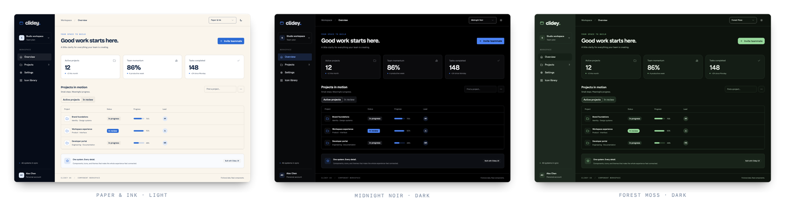 The same components across Paper and Ink, Midnight Noir, and Forest Moss
These captures use the same workspace and data. Only the palette and color mode change.
Try a palette#
Your product, in character.
The same controls and state follow the selected palette.
Preview tokens are scoped to this example; the documentation theme stays yours.
Choose a default#
TSX
import { ThemeProvider } from '@clidey/ux';
import '@clidey/ux/styles.css';
import '@clidey/ux/theme-fonts.css';

<ThemeProvider defaultPalette="forest-moss" defaultTheme="dark">
  <App />
</ThemeProvider>
defaultPalette is used when there is no valid saved palette. defaultTheme similarly supplies the initial mode. Existing choices in local storage take precedence.
Let the user choose#
TSX
import {
  Select, SelectTrigger, SelectValue, SelectContent, SelectItem,
  themes, useTheme,
} from '@clidey/ux';

export function PalettePicker() {
  const { palette, setPalette } = useTheme();
  return (
    <Select value={palette ?? 'default'}
      onValueChange={value => setPalette(value === 'default' ? null : value)}>
      <SelectTrigger aria-label="Color palette"><SelectValue /></SelectTrigger>
      <SelectContent>
        <SelectItem value="default">Default tokens</SelectItem>
        {themes.map(theme => (
          <SelectItem key={theme.id} value={theme.id}>{theme.name}</SelectItem>
        ))}
      </SelectContent>
    </Select>
  );
}
Keep this picker inside ThemeProvider. Mode and palette have separate persistence keys, so someone can prefer Forest Moss and still follow their operating system's light/dark setting.
The catalog#
| Palette ID | Name |
|---|---|
| paper-ink | Paper & Ink |
| midnight-noir | Midnight Noir |
| arctic-steel | Arctic Steel |
| obsidian-vault | Obsidian Vault |
| nordic-frost | Nordic Frost |
| ice-crystal | Ice Crystal |
| newspaper-gothic | Newspaper Gothic |
| tokyo-zen | Tokyo Zen |
| velvet-rose | Velvet Rose |
| desert-sandstone | Desert Sandstone |
| cyber-matrix | Cyber Matrix |
| hologram-hud | Hologram HUD |
| retro-amber | Retro Amber |
| midnight-raid | Midnight Raid |
| berlin-techno | Berlin Techno |
| brutalist-concrete | Brutalist Concrete |
| neon-tokyo | Neon Tokyo |
| vapor-synth | Vapor Synth |
| candy-pop | Candy Pop |
| seoul-neon | Seoul Neon |
| sao-paulo-carnival | São Paulo Carnival |
| aurora-glass | Aurora Glass |
| deep-ocean | Deep Ocean |
| sydney-surf | Sydney Surf |
| forest-moss | Forest Moss |
| ember-forge | Ember Forge |
| mars-colony | Mars Colony |
| solar-gold | Solar Gold |
| mumbai-spice | Mumbai Spice |
| sahara-dusk | Sahara Dusk |
Inspect the definition#
TSX
import { getThemeById } from '@clidey/ux';

const palette = getThemeById('paper-ink');
console.log(palette?.typography, palette?.motion, palette?.surface);
ThemeDefinition includes id, name, description, personality, css, className, dataAttr, typography, motion, and surface. Read metadata from the catalog instead of keeping a second list in your application.
Outside React#
CSS
@import '@clidey/ux/theme-palettes.css';
@import '@clidey/ux/theme-fonts.css';
JavaScript
const root = document.documentElement;
root.classList.add('theme-paper-ink', 'dark');
root.dataset.theme = 'paper-ink';
Remove the previous palette class when switching. These assets share the React catalog's semantic tokens; they do not provide React components or a preference persistence layer.
Make the change meaningful#
Use semantic classes such as bg-background, text-foreground, and border-border in product layouts. A hardcoded white card or gray text will not follow the palette. Test the actual content in both modes: a palette does not replace contrast, focus, chart-legibility, or reduced-motion checks.
Was this page helpful?