
The icon catalog
The package includes 489 catalog entries. Use named React components for fixed icons, CatalogIcon for a dynamic name, or the asset entry point for raw SVG URLs. Applications can use the UX catalog directly without adding another icon dependency.
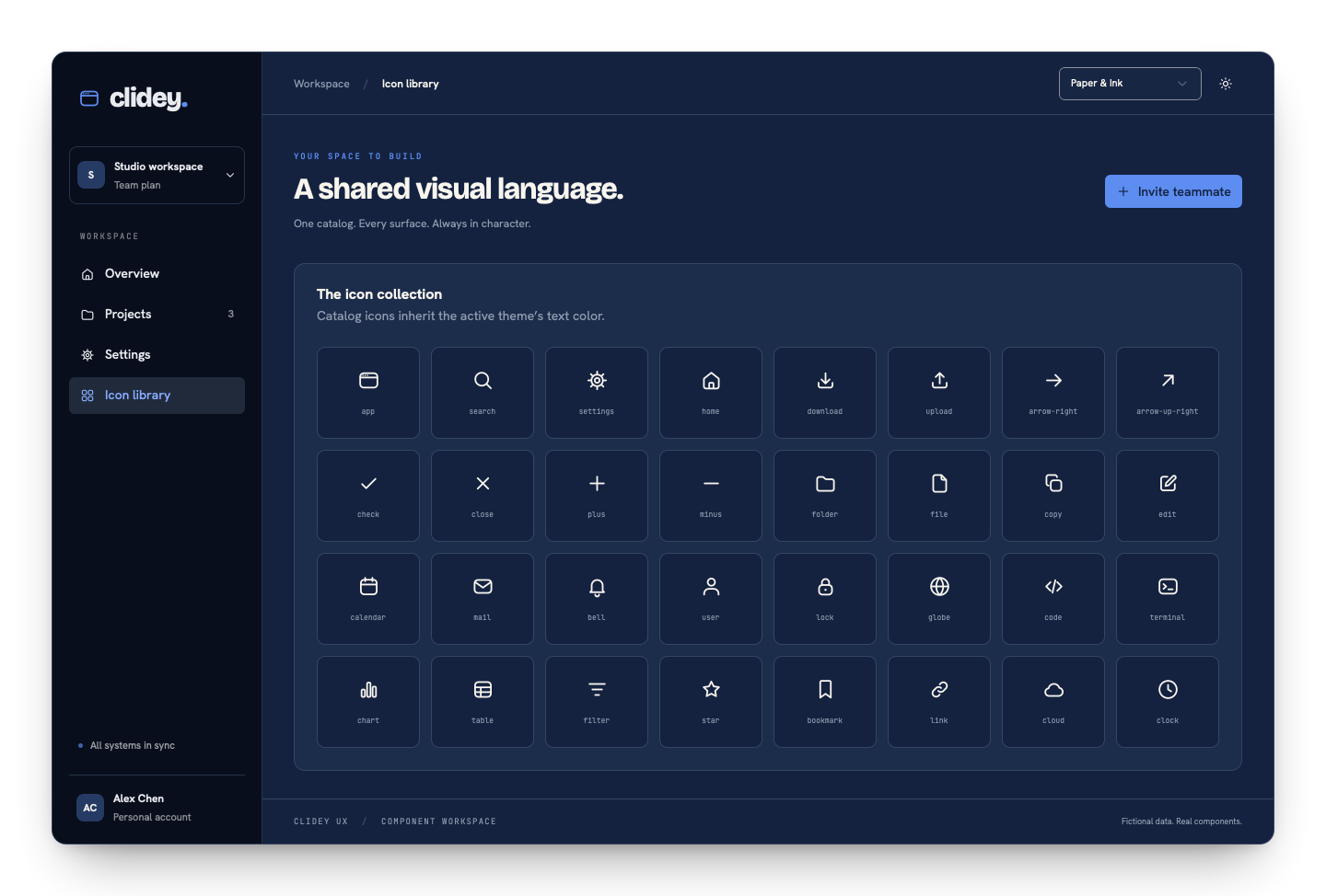 Clidey UX icon catalog and component examples
Try the catalog#
searchChoose an icon and size. Artwork comes from the UX catalog.
Named React icons#
TSX
import { Button, IconSearch, IconDownload } from '@clidey/ux';

<Button variant="outline"><IconDownload /> Export</Button>
<Button variant="ghost" size="icon" aria-label="Search">
  <IconSearch size={20} />
</Button>
Named icons accept standard SVG attributes, a numeric size (24 by default), and refs. They inherit currentColor; use the surrounding text color or className to change them.
Dynamic names#
TSX
import { CatalogIcon } from '@clidey/ux';
import { icons } from '@clidey/ux/icons';

function NavigationIcon({ name }: { name: string }) {
  const safeName = Object.hasOwn(icons, name) ? name : 'app';
  return <CatalogIcon name={safeName} size={20} />;
}
Unknown catalog names throw. Validate values from APIs, user settings, or stored data before rendering them. The URL map is also useful for building a searchable picker.
SVG assets#
TSX
import searchUrl from '@clidey/ux/icons/svg/search.svg?url';
import { icons } from '@clidey/ux/icons';

<img src={searchUrl} width={20} height={20} alt="" />
<img src={icons.search} width={20} height={20} alt="" />
The ?url suffix is a Vite feature. In another bundler, use its SVG asset handling or copy individual SVG files to public assets. The asset entry point does not require React. An SVG loaded through an image does not inherit its parent's text color; use the React catalog for theme-colored UI icons.
Naming and alternatives#
Catalog keys use lowercase hyphenated names such as arrow-right. React exports use the Icon prefix and PascalCase: IconArrowRight. Distinct artwork with a shared base name has an -alt suffix and a corresponding Alt export.
Use the interactive catalog to browse names. The generated component file derives named exports from the same source catalog.
Accessibility#
Decorative catalog icons are hidden from assistive technology by default. Label the control when the icon is its only content. If an icon communicates information on its own, give the icon an aria-label. Pair status colors with visible words.
Icon is a separate wrapper for presentation variants (plain, subtle, and solid); see the Icon reference.
Was this page helpful?